Edeka
The smoothest pitch that turned into the website relaunch of Germany’s coolest grocery store. #supergeil
First things first: I created a basic color set based on the core brand with a focus on two highlight colors for both dark and light backgrounds. Plus a new copy font.
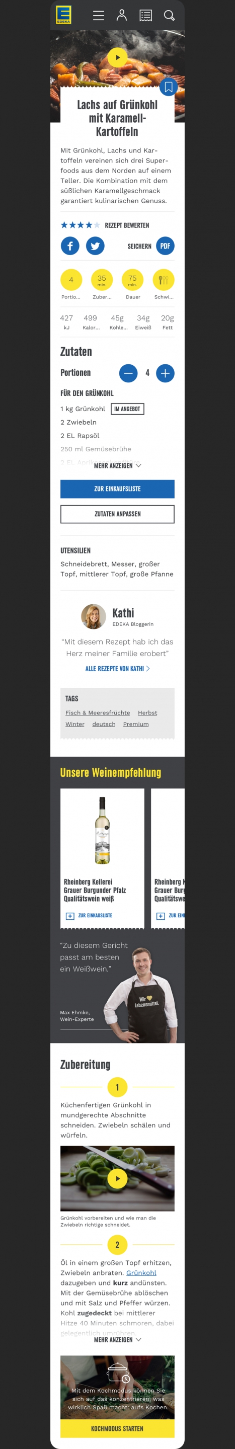
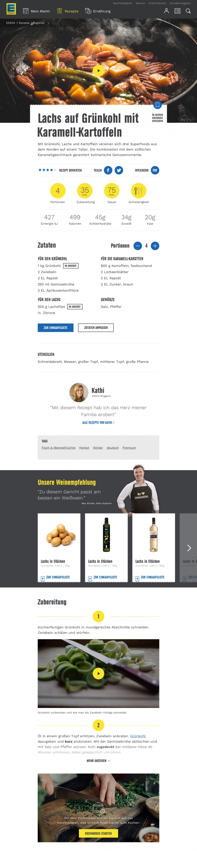
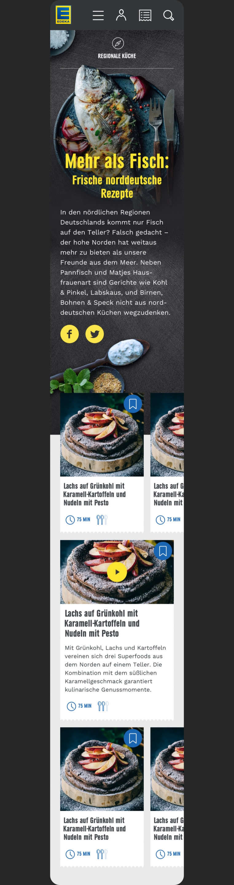
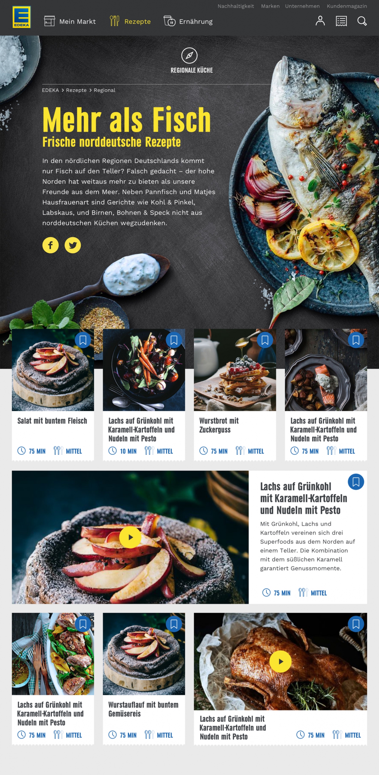
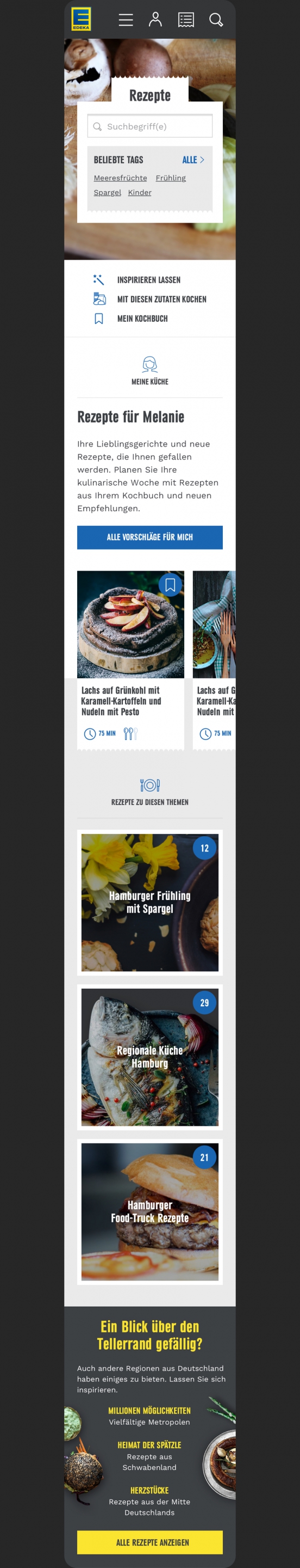
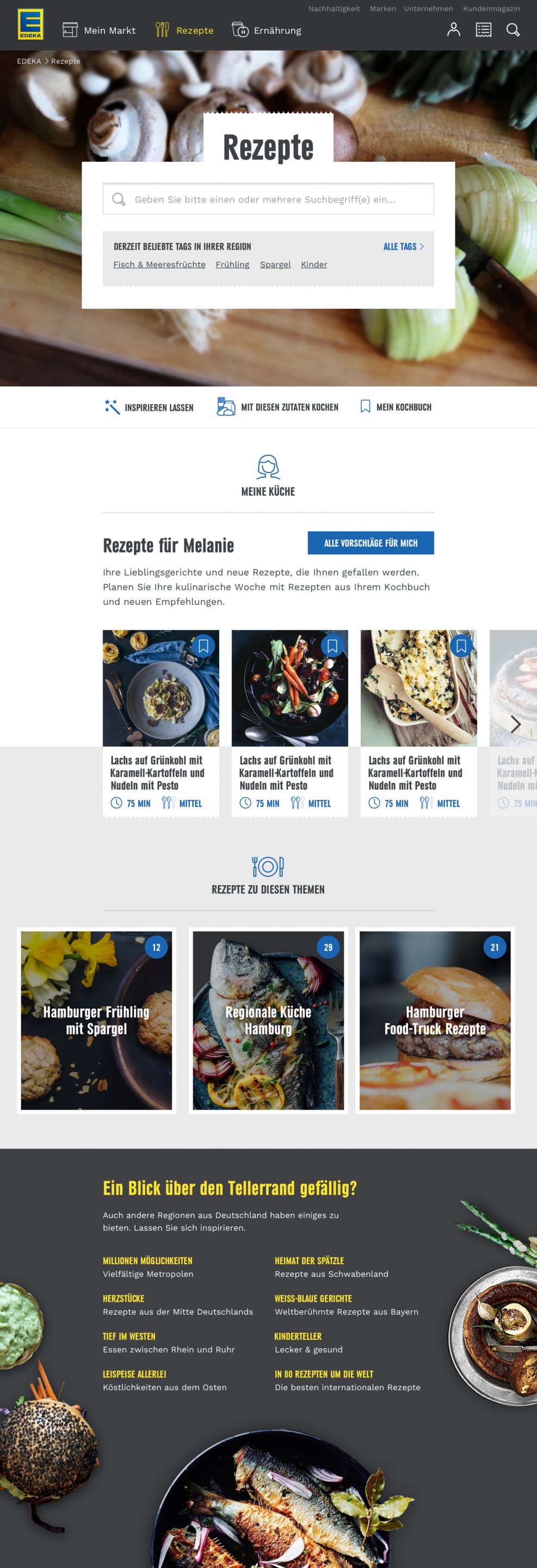
The website launched successively, starting with recipes, my market and weekly deals. The focus was on creating the best recipe experience on the market.
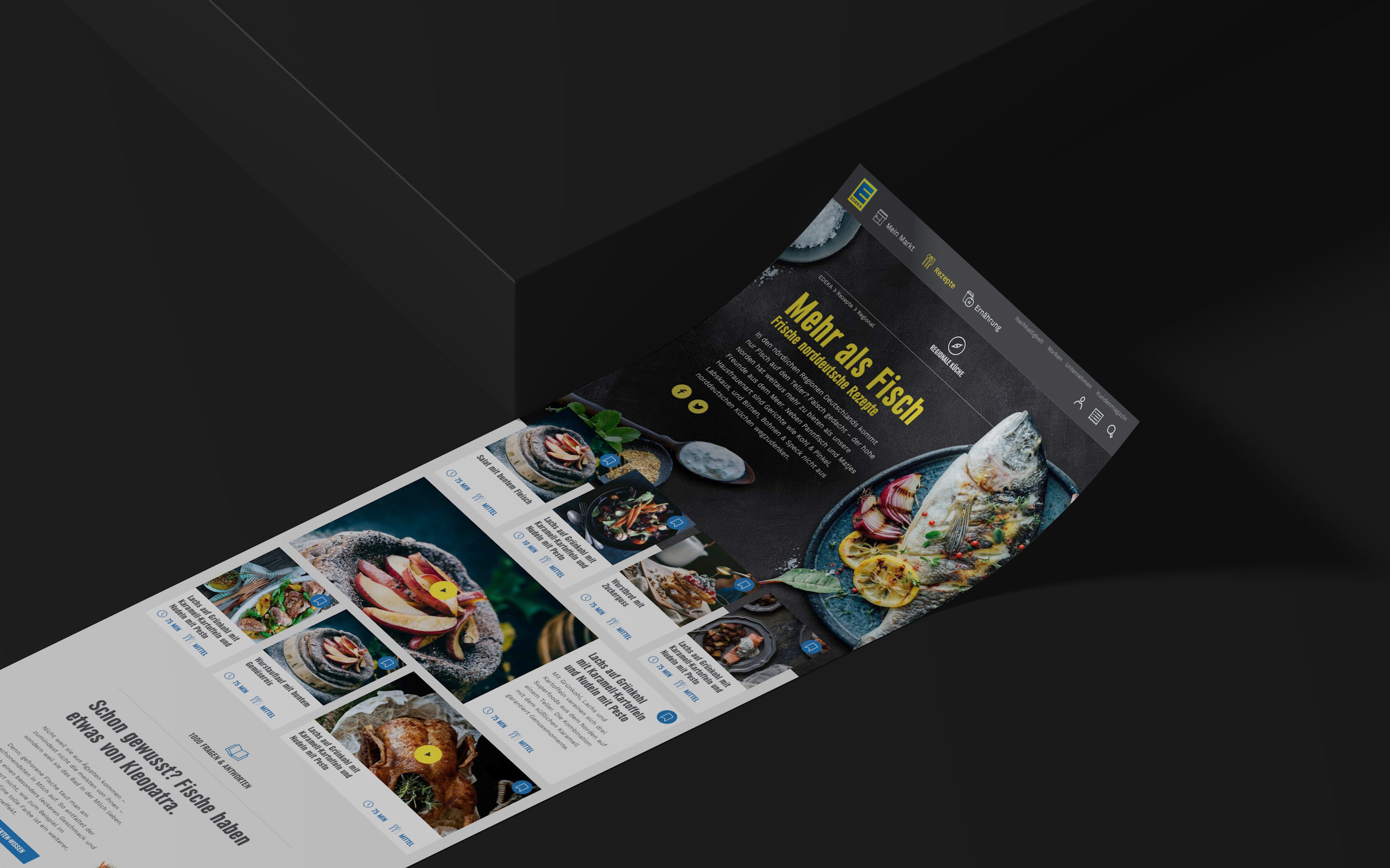
No need to ask Google. Edeka has maaaaany recipes to search for. From asparagus to zucchini. Edeka it!
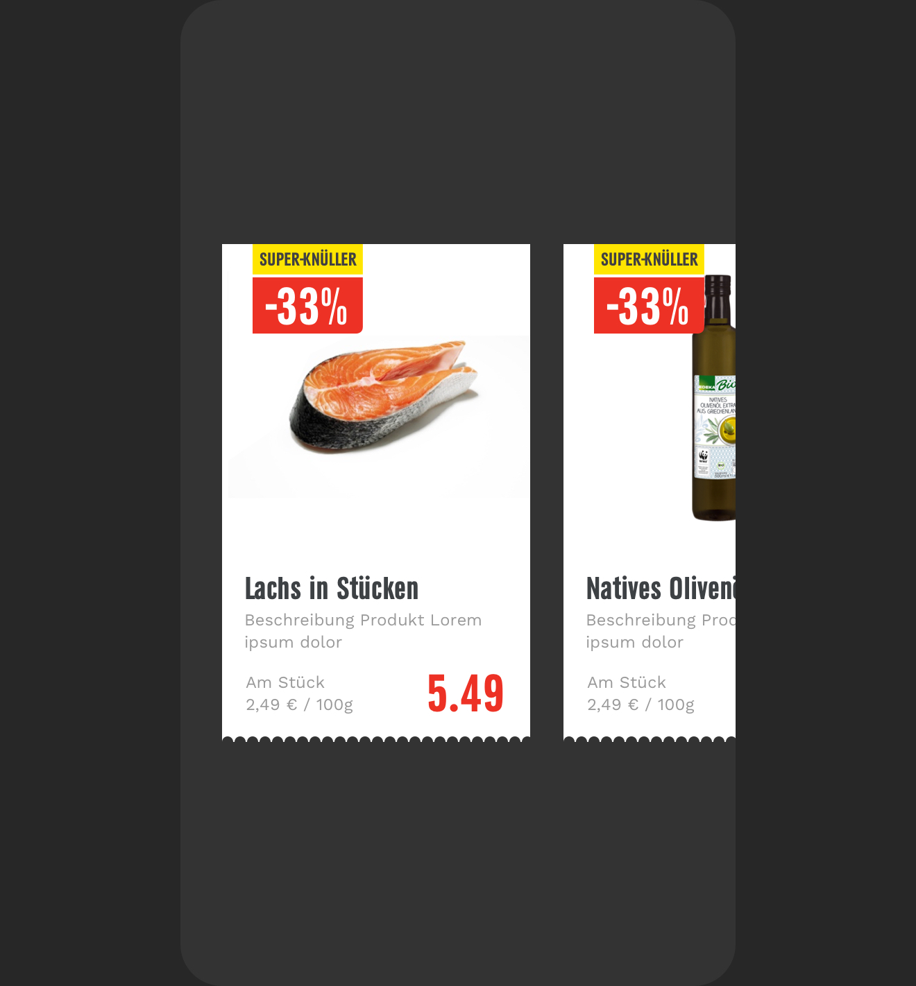
Cleaning up the product teaser to make it look more minimal and modern. Plus I created seven versions of torn paper – the right one got selected.
We also redesigned the recipe page to inspire users to cook fresh meals with Edeka products. Some recipes also include tutorial videos. Enjoy your meal.