

Reilhofer
Started off with an honest discussion and workshop on the current visual language and the potential to create unique imagery and straight forward digital branding.
We set up a hands-off process including the client into all visual decisions from type, grids, colors, UX/UI and 3D. The complexity of their products had to be told in a simple and appealing way.

Beginning with an extensive research on typography – resulting in a modern, minimalistic, grotesque type face.
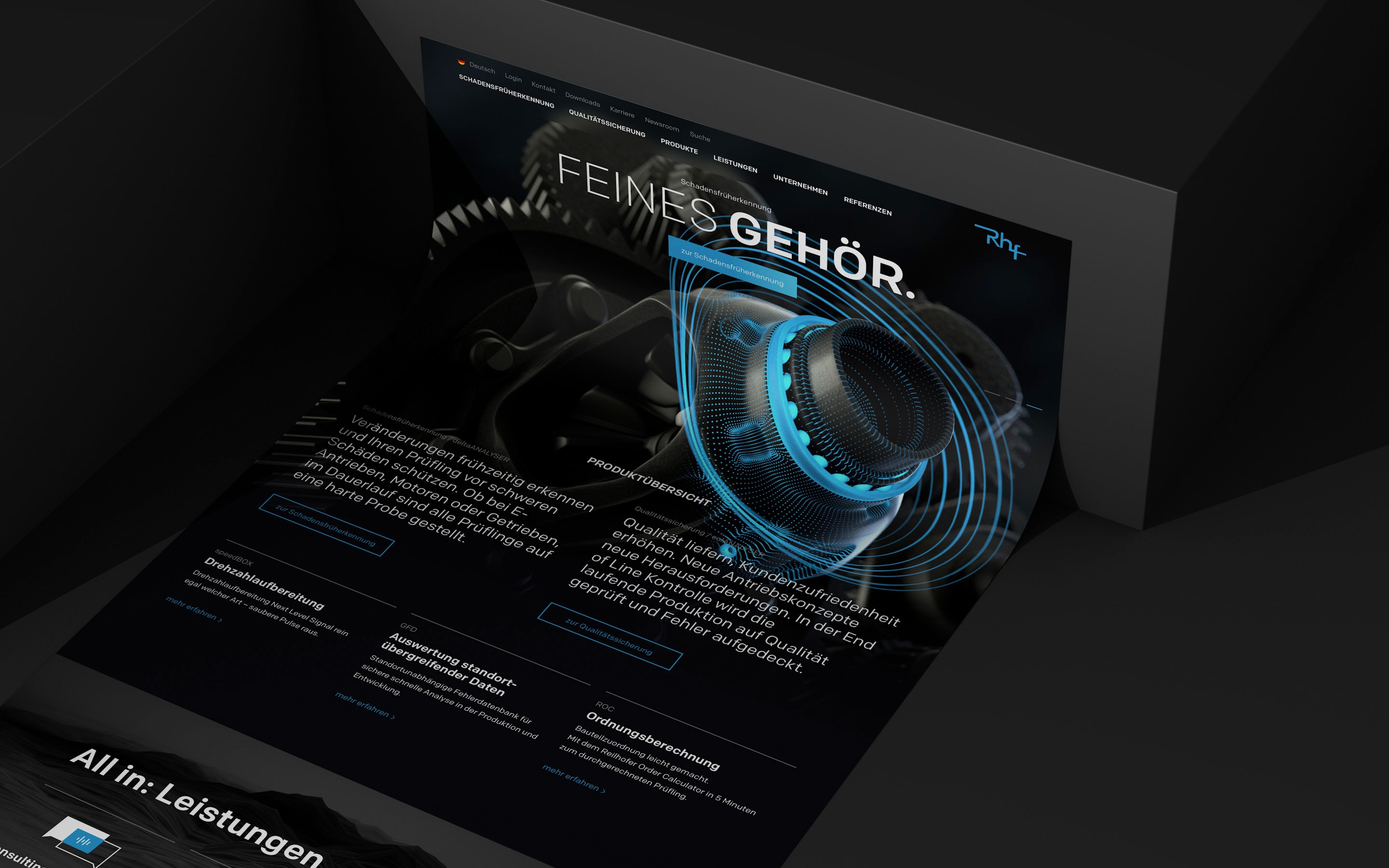
Art Direction for 3D visuals and videos to visualize the product portfolio. The light rings symbolize the detection of failures during the testing process.
The main output of the workshop was to help non-engineers understand the products in a more familiar vocabulary next to engineer-focused content.
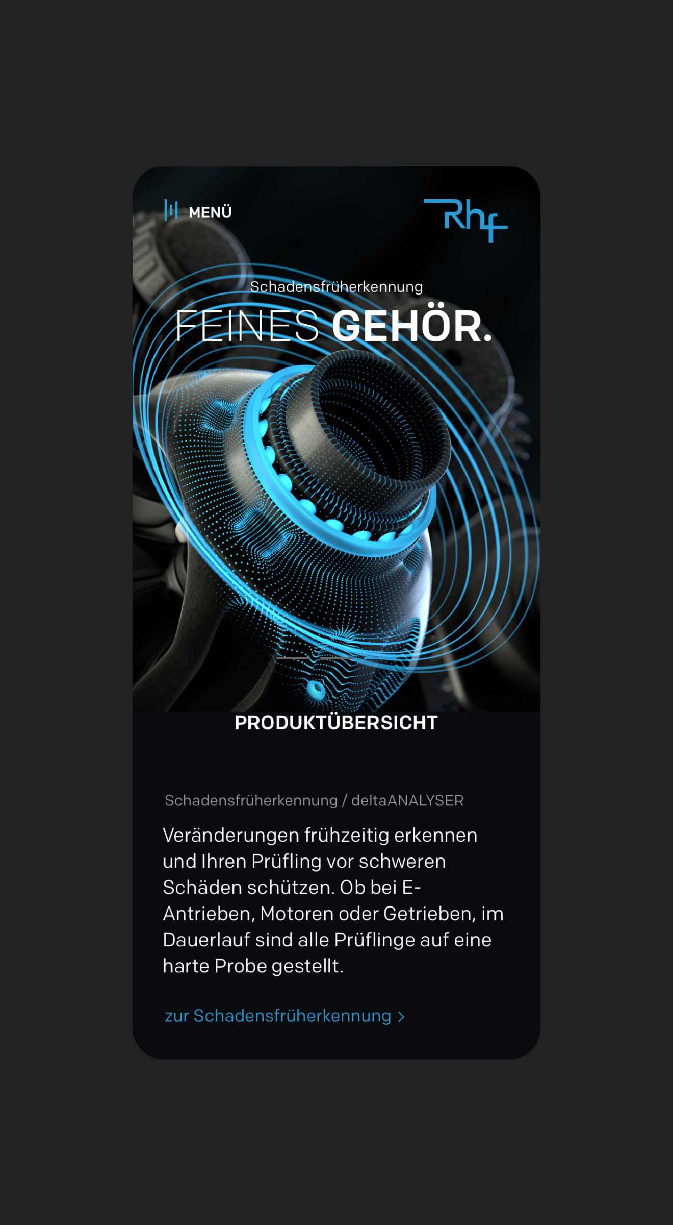
Desktop and mobile designs were created at the same time, keeping mobile functionality always in focus. That’s why we created mobile optimized modules.


Long copy product pages had to be visually appealing as well. We structured and sliced the content into small snackable pieces.
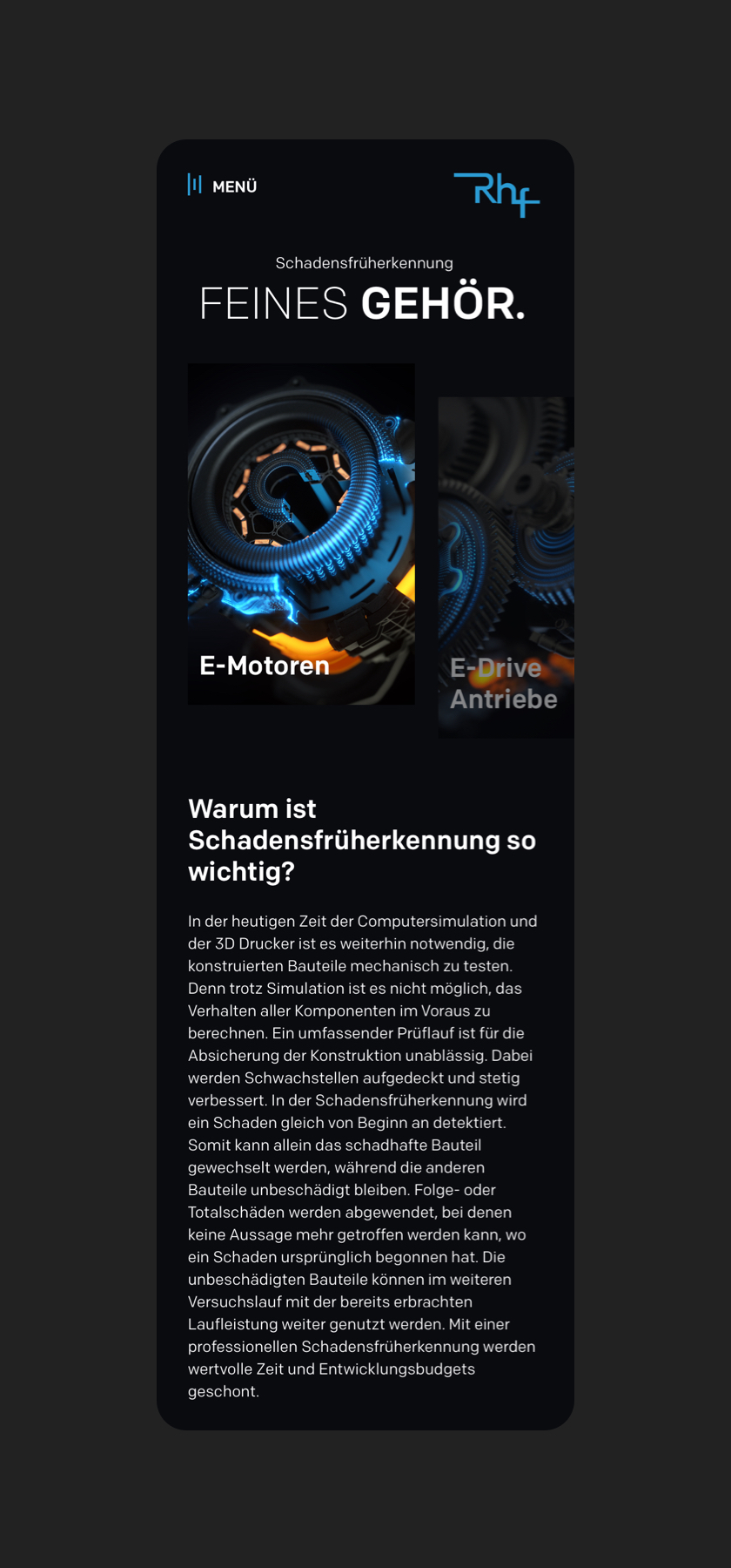
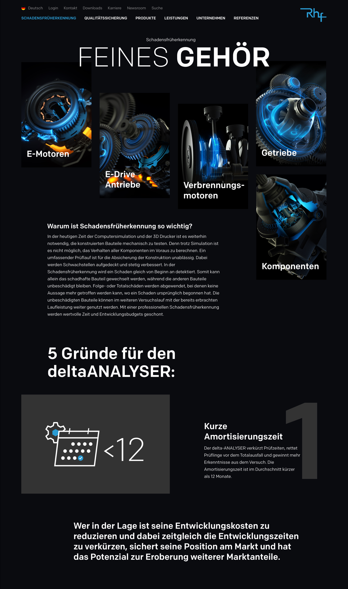


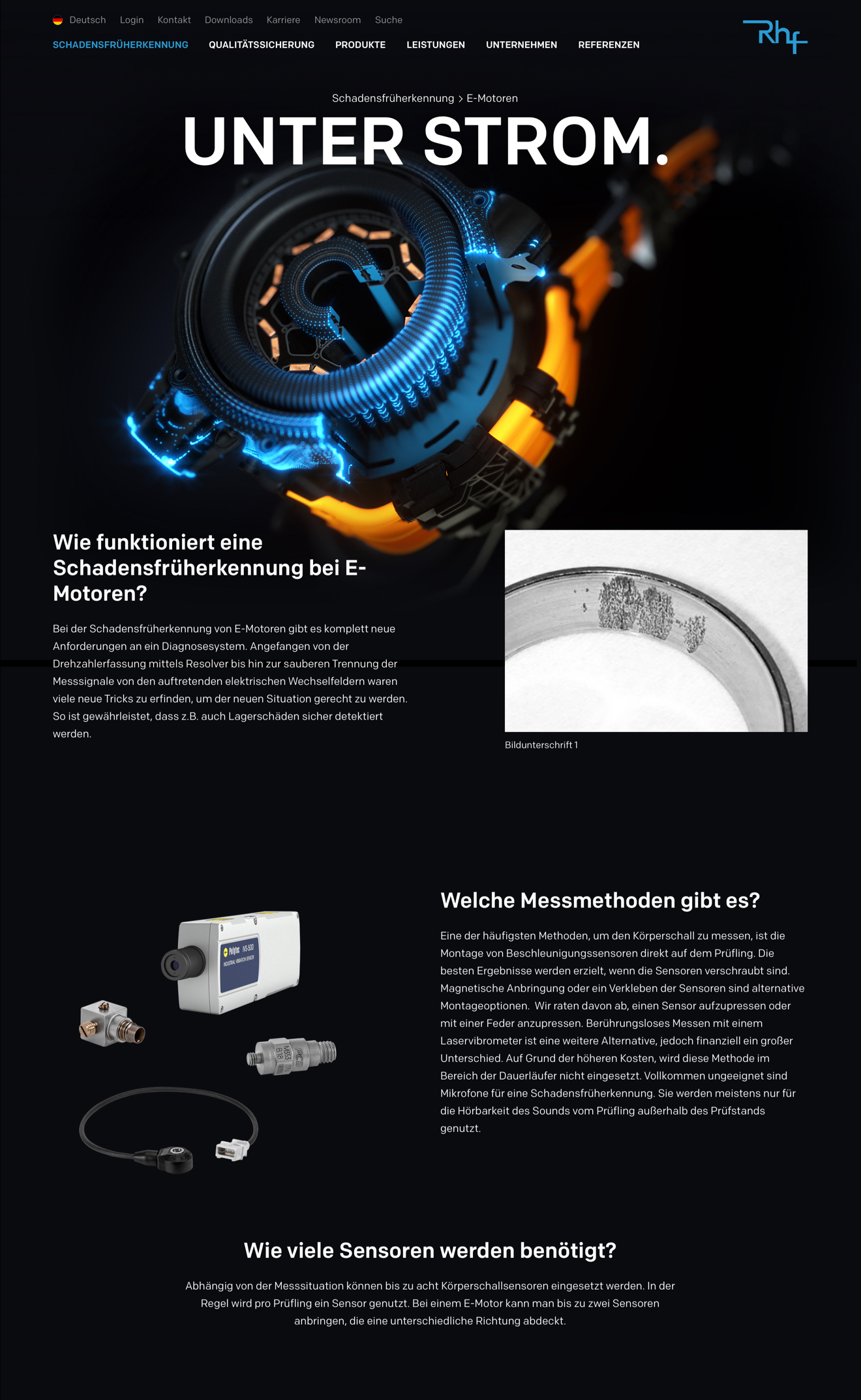
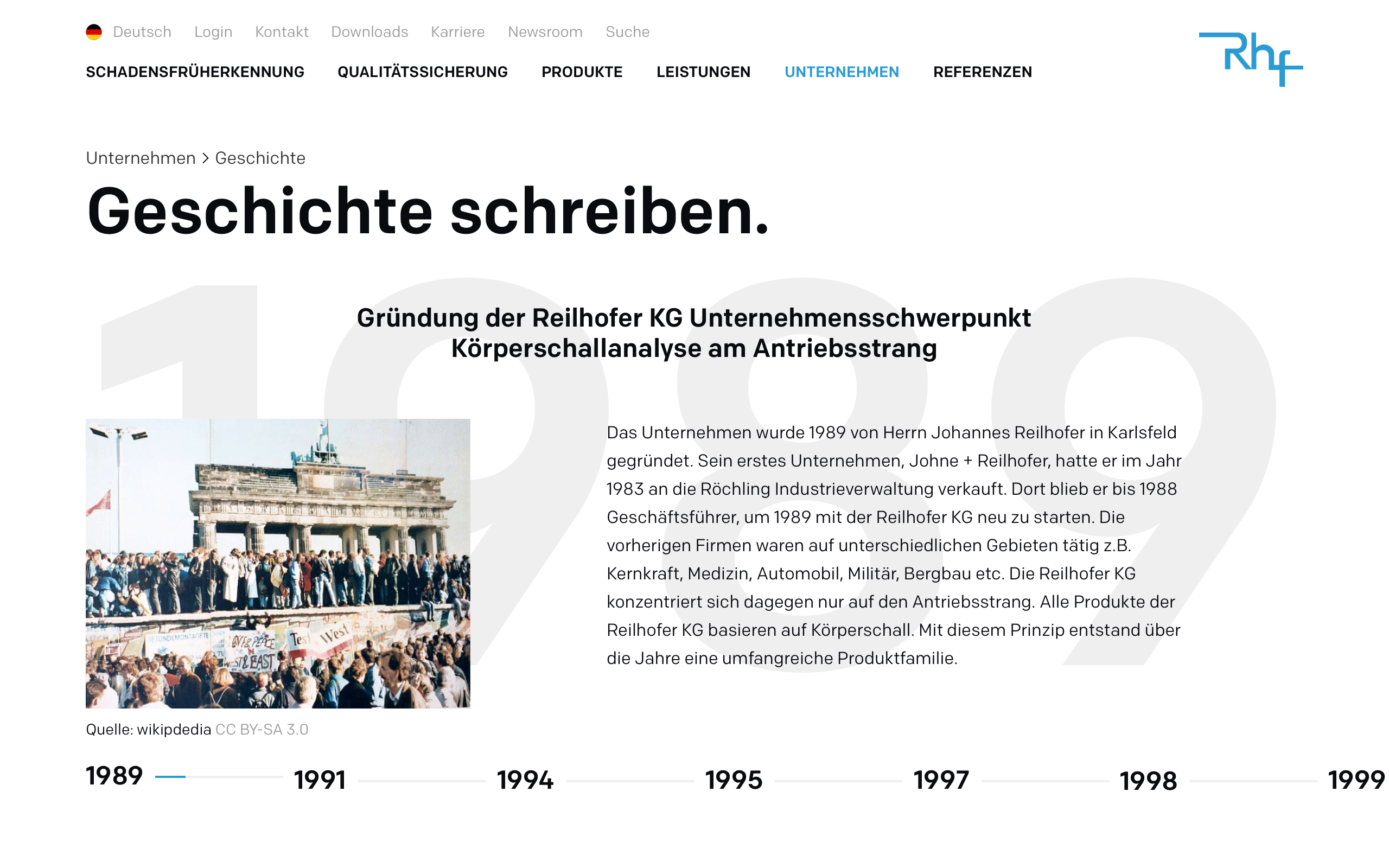
Product related pages appear in dark mode while company content comes in light colors.
